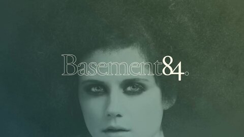
Inspired by techniques in the darkroom, and the way polaroids expose, the website featured subtly shifting colours and fades throughout.
Designed to complement the period listed building, we used the 84 as the main mark. This was the focal point and shorthand on communications, with the full name usually located at the bottom, to reflect the location and positioning of the studio.
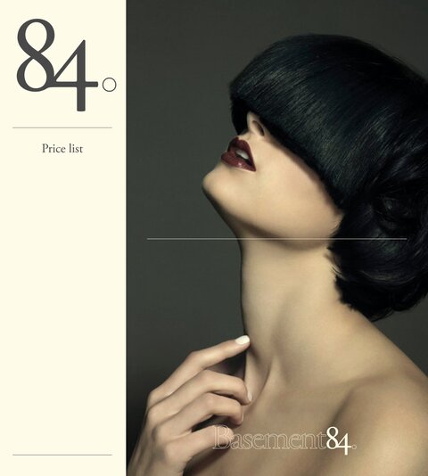
Website

The website was a simple, single page site that 'developed' on first visit, exposing the content gradually.