Cultural Currents

  • Identity design
  • Motion
  • Computation
  • Printed matter

Visual identity developed for a user research project, part of some ongoing work developing approaches to innovation in the shipping sector. The identity needed to exist in multiple media, with printed outcomes, animated/motion as well as interactive/online. The design evolved through a series of reports, presentations and an interactive map.

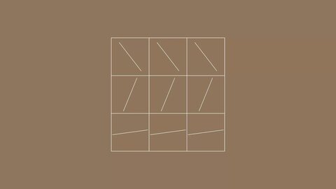
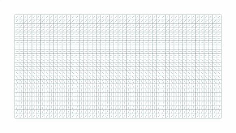
The visual identity uses a grid with directional lines arranged in a flowfield that is in constant motion. This is partly inspired by the graphic language of nautical charts, representing the needle of a compass as well the currents of the ocean, depending on the scale/context. The simplicity of the grid allows it to be flexible, with a secondary purpose representing the many people that are part of the global community included in the research, and the network they form.

Custom typography

Using the grid I created a custom display typeface that can be animated as well as used for headlines in print, and section/agenda dividers as above.

Section dividers

The flowfields and grid are used as a decorative element in cover pages and dividers, which subtly brings the identity back to the people and community involved.

Visual identity explorations

Client

Digi2al

Tags

  • Identity design
  • Motion
  • Computation
  • Printed matter